Terence Gower
In an axonometric drawing, vertical lines remain vertical, parallel lines remain parallel, and all lines parallel to the principal axes (axonometric lines) are drawn to scale. This means that three dimensional space can be rendered with all coordinates to scale and without the distortion of perspective. A cube can be conjured with extremely reduced means: a square and two diamonds.
The Colour/Plane Study drawings are made up of three series of drawings plus a single rendering of a cube. These axonometric drawings take three built structures as models for a study on the effects of coloured planes. The drawings are done with wax pencil and technical pen on mylar, and measure 18 x 24 inches (45 x 60 cm) each. They can be shown hanging from clips like working drawings on a cool grey painted wall or framed with a 50% cool grey backing mat.
1. The Cube This drawing, which is not really cubic, is a study of how colour effects the perception of space. Because of the characteristics of each of the three colours to either recede, expand or to hold still, the juxtaposition of the coloured planes give the optical illusion of a perfect cube.
2. The Barcelona Pavilion was built by Mies van der Rohe in 1929. In the layout of the vertical planes of the pavilion, Mies admitted the influence of the drawings and paintings of Theo van Doesburg. In these Colour/Plane Studies, red and white have been applied to the vertical planes of the pavilion using two different systems, evoking the axonometric drawings Theo van Doesburg created for his unbuilt projects. These drawings represent the idea of van Doesburg’s influence on the Barcelona Pavilion extending beyond the layout of the floor plan to the colouring of the walls (Van Doesburg was in fact an advocate of a new profession; that of architectural “colorist”.)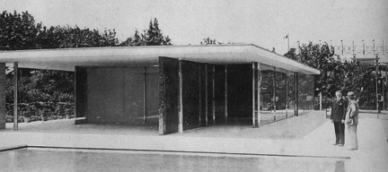
Ludwig Mies van der Rohe. Barcelona Pavilion, 1929
3. The Sonsbeek Pavilion was designed in the early 1950’s by one of the central figures in the de Stijl movement with Theo van Doesburg—Gerrit Rietveld. Though the pavilion was designed many years after de Stijl, it bears many of the qualities of the original movement, especially if the structure is represented as an axonometric drawing. In this study, a reduced de Stijl colour scheme, consisting of just red and white has been applied to the vertical planes of the 1953 Sonsbeek pavilion.
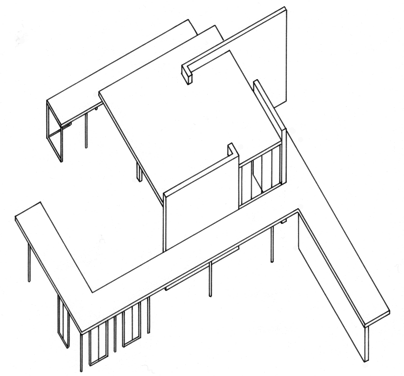
Axonometric rendering of the Sonsbeek Pavilion by Gerrit Rietveld, 1953
4. The Studio Colour/Plane Study drawings show my studio in New York with two versions of the red/white colour scheme applied to the walls. With more architectural details (windows, doors, floor) it is easier to imagine entering this space as an installation of coloured walls. If one were able to enter the space shown in the drawing, the visual intensity of the solid red wall would affect one’s perception of the space. This is what Lazslo Moholy-Nagy referred to as color’s potential for “space articulation.”
In his interiors, Le Corbusier also used the effect of light and color to emphasize spatial, architectural qualities. He often painted planes in solid colors in order to either highlight or alter the spatial characteristics of a room. He used assertive tones, like red, to “hold the wall,” and other colors, like blue, to make a wall recede. In this way, Le Corbusier claimed to use color to “create space.”
In one of these drawings, I have covered one of the walls with a photographic mural. The floor-to-ceiling photo mural, especially with depictions of architecture, was a device frequently employed by Mies van der Rohe and Moholy-Nagy in their exhibition designs. The architectural space displayed in the photographs gave the illusion of extending the exhibition space. The photographic mural in the Color/Plane Study depicts the architectural complex of the Mexico City Polytechnic Institute. Designed by Reynaldo Perez Rayon and completed in 1963, the Polytechnic Institute is a rare example of Functionalist Architecture on such a large scale. Installed in the hypothetical studio in the drawing, this photomural has the effect of extending the space.
What is interesting to me is how so many members of the twentieth century avant gardes used colour in space for similar optical and spatial effects. These experiments in colour have left a legacy in artists like Donald Judd, who studied the avant gardes and wrote about the spatial/optical effects of colour in his early red sculptures.